Clustering with K-Means
I discuss a commonly used unsupervised learning method called clustering via K-means algorithm.
Clustering is a useful algorithmic pattern recognition tool commonly utilized for data pre-processing. Unlike classification or regression task, clustering algorithms do not intend to find patterns between the independent and dependent variables. There are no labels that we are trying to match with our favorite supervised learning algorithms (e.g. ordinary linear regression). Since there is no dependent variables, clustering can be considered as an algorithmic pattern recognition tool with no well-defined prior goal. Instead, with clustering we may hope to extract patterns that are inherent specific to a given dataset, with the aim to gain more insight or to aid modelling the data. In light of these differences, clustering can be categorized as an unsupervised learning algorithm.
In this post, I will take a practical approach to introduce the concept of clustering as a useful method in data centric practices focusing on a specific clustering algorithm called the K-means algorithm.
Clustering
We first dive into clustering analysis. In clustering, we strive to meaningfully group the data instances in a dataset. Here, I will explore clustering analysis through an example. For this purpose, we focus on an interesting dataset provided by the world happiness report which is an organization that has an aim to review the state of happiness around the world, studying how the science of happiness explains personal and national variations in happiness.
The data is publicly available and can be downloaded via the link. The specific dataset we will focus on is already processed, consisting of values/scores derived from the observations on various attributes (such as GDP per capita, Social support, Healthy Life Expectancy) across different countries, as well as average “scores” derived from subjective survey questions represented by the attributes such as Life Ladder, Positive/Negative Affect. You can find a detailed account on the meaning of these variables via the appendix. Setting up the required libraries and plotting configuration, we first import the data and show all the columns:
1
2
3
4
5
6
7
8
9
10
11
12
13
14
15
16
17
18
19
20
import numpy as np
import matplotlib.pyplot as plt
import matplotlib as mpl
import pandas as pd

mpl.rcParams['text.usetex'] = True

#For inline plotting
%matplotlib inline
%config InlineBackend.figure_format = 'svg'

plt.style.use("seaborn-v0_8-dark")

# import the dataset
wh_report = pd.read_excel('World_Happiness_Report.xls')

# slice it by year, focusing on 2022
report_df = wh_report[wh_report.year == 2022]

report_df.columns.to_list()
Output:
['Country name',
 'year',
 'Life Ladder',
 'Log GDP per capita',
 'Social support',
 'Healthy life expectancy at birth',
 'Freedom to make life choices',
 'Generosity',
 'Perceptions of corruption',
 'Positive affect',
 'Negative affect']
For the ease of visualization, we first perform clustering to the countries based on the scores of two attributes: Life Ladder and Perceptions of corruption. According to the appendix provided by the world happiness report, these attributes have the following meaning:
Life Ladder: It is the national average response to the question of life evaluations. The English wording of the question is “Please imagine a ladder, with steps numbered from 0 at the bottom to 10 at the top. The top of the ladder represents the best possible life for you and the bottom of the ladder represents the worst possible life for you. On which step of the ladder would you say you personally feel you stand at this time?”Perceptions of corruption: The measure is the national average of the survey responses to two questions: “Is corruption widespread throughout the government or not” and “Is corruption widespread within businesses or not?” The overall perception is just the average of the two $0$ or $1$ responses. In case the perception of government corruption is missing, we use the perception of business corruption as the overall perception. The corruption perception at the national level is just the average response of the overall perception at the individual level.
We first re-label some columns to be able access easily and drop any rows with missing values.
1
2
3
4
5
6
7
# dictionary for the purpose of renaming columns
column_dict = {'Country name': 'country', 'Life Ladder': 'life_ladder',
               'Perceptions of corruption': 'corruption_perception'}
report_df = report_df.rename(columns = column_dict)

# drop all instances(rows) with a missing value
report_df = report_df.dropna()
We then make a scatter plot in the two-dimensional plane of life_ladder and corruption_perception using the script below:
1
2
3
4
5
6
7
8
9
10
11
12
13
14
15
plt.figure(figsize = (9,5))
plt.scatter(report_df.life_ladder, report_df.corruption_perception,
            marker= 'o', color = 'black', alpha =0.4)

# Add country names at corresponding (x, y) locations
for idx, _ in report_df.iterrows():

    plt.text(report_df.life_ladder[idx], report_df.corruption_perception[idx],
             report_df.country[idx][:3],
             fontsize=8, ha='right', va='bottom', color='blue')

plt.xlabel('Life Ladder Score')
plt.ylabel('Corruption Perception Score')

plt.grid()
The resulting plot is shown in Figure 1.
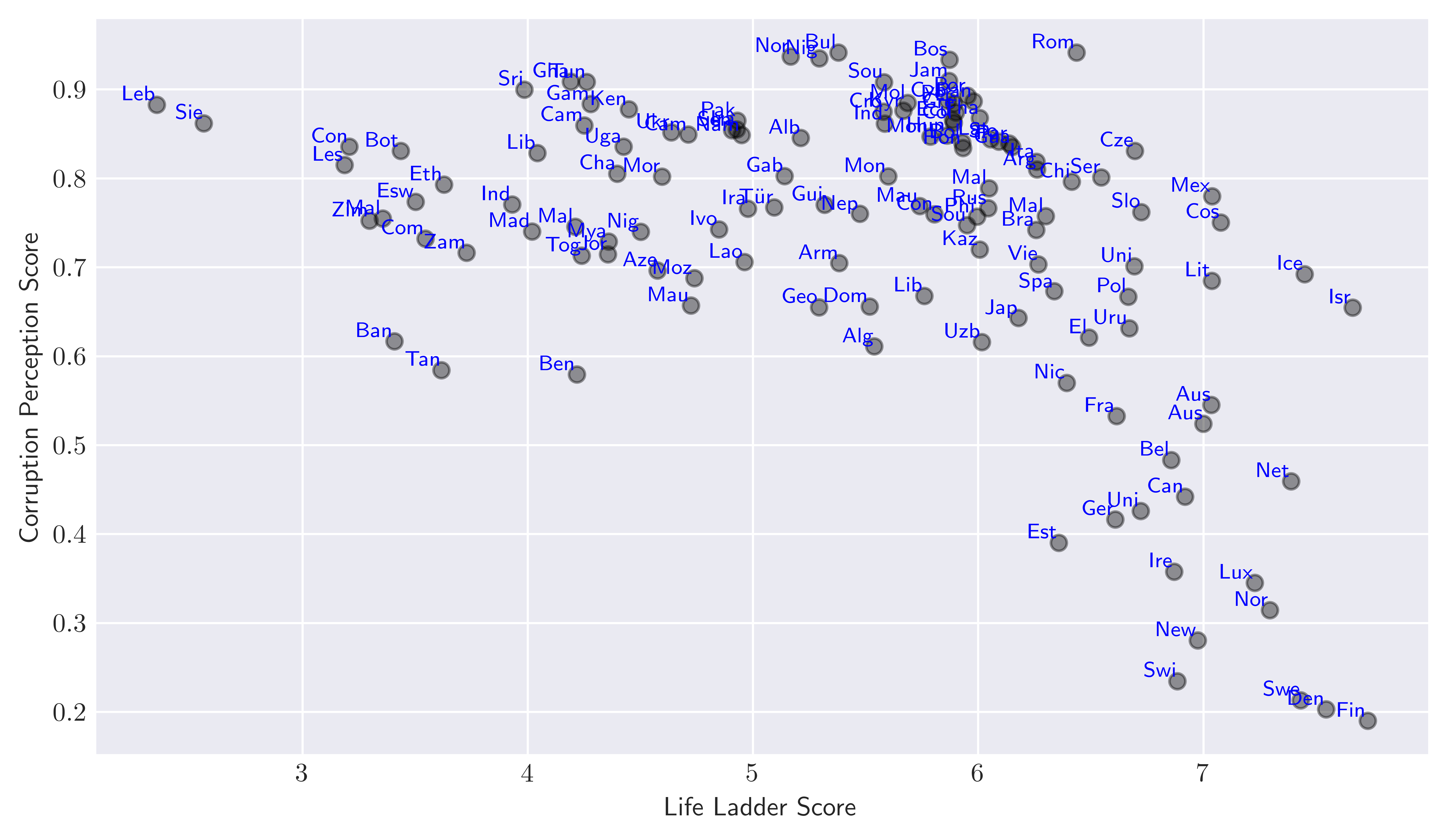 Figure 1. Scatter plot of countries according to their
 life_ladder and corruption_perception score.
By visually inspecting the plot we can group countries that have similarities based on life_ladder and corruption_perception score. For example in the lower right corner of the plot, we can think of Ireland (Ire), United Kingdom (Uni), Germany (Ger) … belonging to the same group while Botswana (Bot), Congo (Con) and India (Ind) to another on the upper right. We can of course think of other clusters, but you get the general idea: The goal of clustering in this context would be to meaningfully group all these countries according to their values within the two-dimensional plane we present so far. Here, when we say meaningful we imply that the clusters should be grouped in such a way that the members of the same cluster are similar, while the members of different clusters are different in the sense of values their attributes undertake.
We can continue to “guess” which cluster each country might belong to by visual inspection, but obviously this would be super inefficient task. To make things more efficient we need a formal measure of “similarity” that would help us to infer the cluster each data point belongs to. Furthermore, here we just focused on a simple two-dimensional example. As we increase the dimensions of the features for the clustering purposes, it would be much harder to inspect visually differentiate the groups that each data instance reside. In short, we need an algorithm for such purposes to efficiently find similarities between data points. In this post, we will focus on K-means algorithm which is one of the popular clustering algorithms that is simple and scalable.
K-means algorithm
K-Means is a random-based heuristic clustering algorithm. Here we use the term random-based because that the output of the algorithm on the same data may be different on every run, while heuristic means that the algorithm does not reach the optimal solution. However, from experience, we know that it reaches a good solution.
Here is the flow-chart of k-mean algorithm:
1) Initialization: For a given choice of integer $k$, assign randomly vectors ${\bf c}_i$, $i = 1,2,\dots,k$ as the cluster centroids of the dataset. Here each of the $k$ vectors is in general a $d$ dimensional where $d$ representing the dimension of the attribute space.
2) Assignment: Assign each data point to the nearest cluster centroid based on the Euclidean distance measure: This will form $k$ clusters based on the closest centroid.
\[\begin{equation} \textrm{assign}\, x \,\textrm{to cluster}\, i \,\textrm{if}\,\, |{\bf x} - {\bf c}_i|^2 = \min_{j \in 1,2,\dots k} |{\bf x} - {\bf c}_j|^2. \end{equation}\]3) Update: Recalculate and update each centroid vector as the mean of all the data points assigned to that cluster:
\[\begin{equation} {\bf c}_i = \frac{1}{n_{c_i}} \sum_{x \in {\bf c}_i} {\bf x}, \end{equation}\]where $n_{c_i}$ is the number of data points within each cluster.
4) Repeat until convergence: Repeat the assignment (step 2) and update (step 3) steps until the centroids stabilize (do not change significantly), or The cluster assignments stop changing.
At each iteration, i.e. the application of steps 2 and 3, K-means algorithm aims to minimize the within-cluster sum of squares (WCSS), also known as inertia:
\[\begin{equation}\label{wcss} \textrm{WCSS} = \sum_{i = 1}^{k} \sum_{\bf x \in {\bf c}_i} |{\bf x} - {\bf c}_i|^2. \end{equation}\]A two-dimensional example
Luckily Python has built-in machine learning libraries that can implement these steps automatically for us. For this purpose, we will first focus on the simple example we provided above to cluster the countries based on corruption_perception and life_ladder using KMeans method from the sklearn.cluster library. The following code snippet performs this clustering task with for a pre-defined choice of $k = 6$ as the number of clusters:
1
2
3
4
5
6
7
8
9
10
11
12
13
14
15
16
from sklearn.cluster import KMeans

cols = ['life_ladder', 'corruption_perception']

X = report_df[cols]
k = 6

k_means = KMeans(n_clusters=k, init = 'random', n_init = 'auto')

k_means_fit = k_means.fit(X)

for i in range(6):

    mask = (k_means_fit.labels_ == i)

    print(f"Cluster{i}: {report_df[mask].country.values}")
Output:
Cluster_0: ['Australia' 'Austria' 'Belgium' 'Canada' 'Costa Rica' 'Denmark' 'Finland'
 'Iceland' 'Ireland' 'Israel' 'Lithuania' 'Luxembourg' 'Mexico'
 'Netherlands' 'New Zealand' 'Norway' 'Sweden' 'Switzerland']
Cluster_1: ['Algeria' 'Bolivia' 'Bosnia and Herzegovina' 'Colombia'
 'Congo (Brazzaville)' 'Croatia' 'Cyprus' 'Dominican Republic' 'Ecuador'
 'Greece' 'Guatemala' 'Honduras' 'Hungary' 'Indonesia' 'Jamaica'
 'Kazakhstan' 'Kyrgyzstan' 'Latvia' 'Libya' 'Malaysia' 'Mauritius'
 'Moldova' 'Mongolia' 'Montenegro' 'Nepal' 'Panama' 'Paraguay' 'Peru'
 'Philippines' 'Portugal' 'Russia' 'Slovakia' 'South Africa' 'South Korea'
 'Thailand' 'Uzbekistan']
Cluster_2: ['Argentina' 'Brazil' 'Chile' 'Czechia' 'El Salvador' 'Estonia' 'France'
 'Germany' 'Italy' 'Japan' 'Malta' 'Nicaragua' 'Poland' 'Romania' 'Serbia'
 'Slovenia' 'Spain' 'United Kingdom' 'United States' 'Uruguay' 'Vietnam']
Cluster_3: ['Albania' 'Armenia' 'Bulgaria' 'Cameroon' 'Gabon' 'Georgia' 'Guinea'
 'Iran' 'Iraq' 'Ivory Coast' 'Laos' 'Mauritania' 'Mozambique' 'Namibia'
 'Nigeria' 'North Macedonia' 'Pakistan' 'Senegal' 'Türkiye']
Cluster_4: ['Azerbaijan' 'Benin' 'Cambodia' 'Chad' 'Gambia' 'Ghana' 'India' 'Jordan'
 'Kenya' 'Liberia' 'Madagascar' 'Mali' 'Morocco' 'Myanmar' 'Niger'
 'Sri Lanka' 'Togo' 'Tunisia' 'Uganda' 'Ukraine']
Cluster_5: ['Bangladesh' 'Botswana' 'Comoros' 'Congo (Kinshasa)' 'Eswatini'
 'Ethiopia' 'Lebanon' 'Lesotho' 'Malawi' 'Sierra Leone' 'Tanzania'
 'Zambia' 'Zimbabwe']
One can confirm that the clustering is performed roughly aligned with our expectations from the visual inspection of the data in Figure 1. However, as the initialization is random (as stated by the init = random flag), each time when we run the algorithm we can get a different result. Here, I find it useful to mention other options regarding the initialization of the algorithm following the official documentation:
1) init: {‘k-means++’, ‘random’}, callable or array-like of shape (n_clusters, n_features), default=’k-means++’ Method for initialization:
‘k-means++’ : selects initial cluster centroids using sampling based on an empirical probability distribution of the points’ contribution to the overall inertia. This technique speeds up convergence. The algorithm implemented is “greedy k-means++”. It differs from the vanilla k-means++ by making several trials at each sampling step and choosing the best centroid among them.
‘random’: choose n_clusters observations (rows) at random from data for the initial centroids.
If an array is passed, it should be of shape (n_clusters, n_features) and gives the initial centers.
If a callable is passed, it should take arguments X, n_clusters and a random state and return an initialization.
2) n_init: ‘auto’ or int, default=’auto’ Number of times the k-means algorithm is run with different centroid seeds. The final results is the best output of n_init consecutive runs in terms of inertia. Several runs are recommended for sparse high-dimensional problems (see Clustering sparse data with k-means).
When n_init = 'auto', the number of runs depends on the value of init: 10 if using init = 'random'or init is a callable; 1 if using init='k-means++' or init is an array-like.
For example, adopting init = k-means++, i.e. greedy k-means algorithm for initialization, the same code above result with a different outcome. For example, the cluster representing the countries on the happy end of the spectrum (the cluster 0) is extended in a particular run of the code as:
Output:
Cluster_0: ['Australia' 'Austria' 'Belgium' 'Canada' 'Costa Rica' 'Czechia' 'Denmark'
 'Finland' 'France' 'Germany' 'Iceland' 'Ireland' 'Israel' 'Lithuania'
 'Luxembourg' 'Mexico' 'Netherlands' 'New Zealand' 'Norway' 'Poland'
 'Slovenia' 'Sweden' 'Switzerland' 'United Kingdom' 'United States'
 'Uruguay']
This outcome is also not so surprising given the plot in Figure 1. Notice however that the algorithm consistently put some countries in the same basket in between the different runs of the same code, as well as when we use a different initialization method.
How can we render the clustering more robust? In the example above, we performed clustering without pre-processing the two attributes we are focused. However, in the context of clustering the relative scale of attributes matter as we assign a data point to its cluster using Euclidean distance measure. Currently, life_ladder play a much important role in the determination of the clusters as its scale is roughly an order of magnitude larger than the corruption_perception. We would rather prefer these attributes to play an equal amount of role, which can be realized by normalizing the data. Here, normalizing the data means the attributes are rescaled in such a way that all of them are represented in the same range. In the code snipped below, we perform min-max scaling using MinMaxScaler method from the sklearn.preprocessing library:
1
2
3
4
5
6
7
8
9
10
11
12
13
14
15
16
17
18
19
from sklearn.cluster import KMeans
from sklearn.preprocessing import MinMaxScaler

scaler = MinMaxScaler()

X_scaled = pd.DataFrame(data = scaler.fit_transform(X), columns = cols)

cols = ['life_ladder', 'corruption_perception']
k = 6

k_meanss = KMeans(n_clusters=k, init = 'random', n_init = 'auto')

k_meanss_fit = k_meanss.fit(X_scaled)

for i in range(6):

    mask = (k_meanss_fit.labels_ == i)

    print(f"Cluster_{i}: {report_df[mask].country.values}")
Output:
Cluster_0: ['Belgium' 'Canada' 'Denmark' 'Estonia' 'Finland' 'Germany' 'Ireland'
 'Luxembourg' 'Netherlands' 'New Zealand' 'Norway' 'Sweden' 'Switzerland'
 'United Kingdom']
Cluster_1: ['Argentina' 'Bolivia' 'Bosnia and Herzegovina' 'Chile' 'Colombia'
 'Congo (Brazzaville)' 'Croatia' 'Cyprus' 'Czechia' 'Ecuador' 'Greece'
 'Guatemala' 'Honduras' 'Hungary' 'Indonesia' 'Italy' 'Jamaica'
 'Kyrgyzstan' 'Latvia' 'Malaysia' 'Malta' 'Mauritius' 'Moldova' 'Mongolia'
 'Montenegro' 'Panama' 'Paraguay' 'Peru' 'Philippines' 'Portugal'
 'Romania' 'Russia' 'Serbia' 'Slovakia' 'South Africa' 'South Korea'
 'Thailand']
Cluster_2: ['Albania' 'Bulgaria' 'Cambodia' 'Cameroon' 'Chad' 'Gabon' 'Gambia'
 'Ghana' 'Iraq' 'Kenya' 'Liberia' 'Morocco' 'Namibia' 'Nigeria'
 'North Macedonia' 'Pakistan' 'Senegal' 'Sri Lanka' 'Tunisia' 'Uganda'
 'Ukraine']
Cluster_3: ['Algeria' 'Armenia' 'Azerbaijan' 'Benin' 'Dominican Republic' 'Georgia'
 'Guinea' 'Iran' 'Ivory Coast' 'Jordan' 'Laos' 'Libya' 'Mauritania'
 'Mozambique' 'Myanmar' 'Nepal' 'Niger' 'Togo' 'Türkiye']
Cluster_4: ['Australia' 'Austria' 'Brazil' 'Costa Rica' 'El Salvador' 'France'
 'Iceland' 'Israel' 'Japan' 'Kazakhstan' 'Lithuania' 'Mexico' 'Nicaragua'
 'Poland' 'Slovenia' 'Spain' 'United States' 'Uruguay' 'Uzbekistan'
 'Vietnam']
Cluster_5: ['Bangladesh' 'Botswana' 'Comoros' 'Congo (Kinshasa)' 'Eswatini'
 'Ethiopia' 'India' 'Lebanon' 'Lesotho' 'Madagascar' 'Malawi' 'Mali'
 'Sierra Leone' 'Tanzania' 'Zambia' 'Zimbabwe']
Notice that the clusters are different using min-max scaled data which is in principle a better way of implementing K-means clustering.
Another issue when implementing K-means clustering is the choice regarding the number of clusters. In the examples above, we just choose to work with $k = 6$, but this is not a magic number we came up with using a sophisticated analysis. In general, domain knowledge regarding the data can help to determine a priori number for the choice of $k$, however there are some approaches that can help to determine it. Here I will briefly mention one of the well known method called the elbow-method which involves plotting the within-cluster sum of squares (WCSS) (or inertia) \eqref{wcss} against the number of clusters $k$. In this method, the “elbow point” in the plot where the rate of decrease in WCSS slows significantly, indicates the optimal $k$ choice:
1
2
3
4
5
6
7
8
9
10
11
12
13
14
15
16
17
18
19
20
21
22
23
24
25
26
27
28
29
30
31
32
33
34
35
36
37
38
39
from sklearn.cluster import KMeans
from sklearn.preprocessing import MinMaxScaler

column_dict =
{'Country name': 'country', 'Life Ladder': 'life_ladder',
'Log GDP per capita': 'log_gdp_pc', 'Perceptions of corruption': 'corruption_perception',
'Social support': 'social_support', 'Healthy life expectancy at birth': 'hle',
'Freedom to make life choices': 'freedom', 'Generosity': 'generosity',
'Positive affect': 'plus_a','Negative affect': 'neg_a'}

report_df = report_df.rename(columns=column_dict)

num_report_df = report_df.drop(columns= ['country', 'year'])

cols = num_report_df.columns.to_list()

X = num_report_df[cols]

scaler = MinMaxScaler()

X_scaled = pd.DataFrame(data = scaler.fit_transform(X), columns = cols)

wcss = []
for k in range(1, 10):
    kmeans = KMeans(n_clusters=k, init = 'random', n_init = 'auto', random_state=42)
    kmeans.fit(X_scaled)
    wcss.append(kmeans.inertia_)

# render wcss as pd.Series to reach at .pct_change() method
series = pd.Series(wcss)
#percent change in the wcss, first entry is nan
change = np.abs(series.pct_change() * 100)

k = len(change[change > 10.]) + 1 #stop at k after which
                                  #the percent change in wcss in less than 10 percent
                                  #slicing does not count the first nan value
                                  # so we add 1 to get k

print(f'Optimal k according to the elbow method: {k}')
Output:
Optimal k according to the elbow method: 5Once we have determined the number of clusters, we can try to gain more insight into their properties by performing a Centroid Analysis.
Centroid Analysis
Centroid analysis, in essence, is a canonical data analytics task that is done once meaningful clusters have been found. We perform centroid analysis to understand what formed each cluster and gain insight into the patterns in the data that led to the cluster’s formation.
This analysis essentially finds the centroids of each cluster and compares them with one another. A color-coded table or a heatmap can be very useful for comparing centroids.
1
2
3
4
5
6
7
8
9
10
11
12
13
14
15
16
17
18
19
20
21
22
import seaborn as sns

clusters = [f"cluster_{i}" for i in range(5)]

kmeans = KMeans(n_clusters=5, init = 'random', n_init = 'auto', random_state=42)
k_means_fit = kmeans.fit(X_scaled)

centroids_df = pd.DataFrame(0.0, index = clusters, columns=X_scaled.columns)

for cluster_id, cluster in enumerate(clusters):

    bool_mask = (k_means_fit.labels_ == cluster_id)

    # assign the median of the datapoints within a cluster for a given attribute
    centroids_df.loc[cluster] = X_scaled[bool_mask].median(axis = 0)

plt.figure(figsize = (9,5))
heatmap = sns.heatmap(centroids_df, linewidths = 0.5, annot=True, cmap='coolwarm')
# rotate attribute labels
heatmap.set_xticklabels(heatmap.get_xticklabels(), rotation=45)

plt.show()
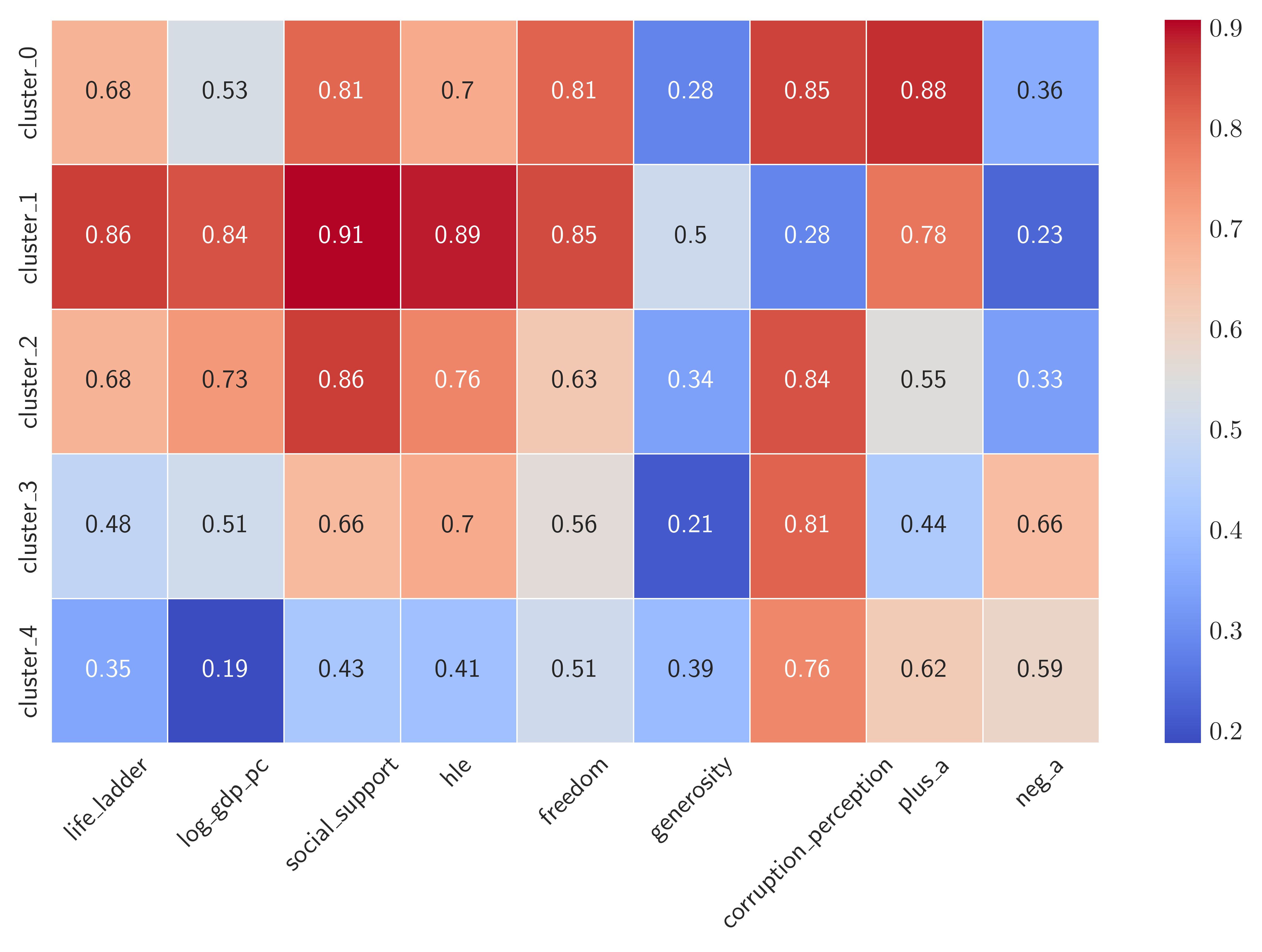 Figure 3. Heatmap of the 5 cluster of countries according to median value of their attributes.
According to the heatmap we can label countries in the cluster_1 as “Very Happy”. These are countries that have high values of “positive” and small values of “negative” attributes. Among the second-happiest cluster of countries, i.e. cluster_0 and cluster_2, the latter seems to have a high GDP per capita, so we may label it as “Wealthy and happy” whereas the countries in the former has more freedom to make life choices, so we may be tempted to label cluster_0 as “Free and Happy”. The least happy countries are among the cluster_3 and cluster_4. They do differ at most by the healthy life expectancy hle, so we might label cluster_3 as “Unhappy but Healthy” and simply label cluster_4 as “Unhappy” as they exhibit low scores in all “positive” attributes. To give more insight, here are the countries corresponding to the 5 clusters:
1
2
3
4
5
for i in range(5):

    mask = (k_means_fit.labels_ == i)

    print(f"Cluster_{i}: {report_df[mask].country.values}")
Output:
Cluster_0: ['Argentina' 'Bolivia' 'Brazil' 'Cambodia' 'Chile' 'Colombia' 'Costa Rica'
 'Czechia' 'Dominican Republic' 'Ecuador' 'El Salvador' 'Guatemala'
 'Honduras' 'Indonesia' 'Jamaica' 'Kyrgyzstan' 'Malaysia' 'Mauritius'
 'Mexico' 'Nicaragua' 'Nigeria' 'Panama' 'Paraguay' 'Peru' 'Philippines'
 'South Africa' 'Thailand' 'Uruguay' 'Uzbekistan' 'Vietnam']
Cluster_1: ['Australia' 'Austria' 'Belgium' 'Canada' 'Denmark' 'Estonia' 'Finland'
 'France' 'Germany' 'Iceland' 'Ireland' 'Luxembourg' 'Netherlands'
 'New Zealand' 'Norway' 'Sweden' 'Switzerland' 'United Kingdom']
Cluster_2: ['Albania' 'Bosnia and Herzegovina' 'Bulgaria' 'Croatia' 'Cyprus'
 'Georgia' 'Greece' 'Hungary' 'Israel' 'Italy' 'Japan' 'Kazakhstan'
 'Latvia' 'Lithuania' 'Malta' 'Moldova' 'Mongolia' 'Montenegro'
 'North Macedonia' 'Poland' 'Portugal' 'Romania' 'Russia' 'Serbia'
 'Slovakia' 'Slovenia' 'South Korea' 'Spain' 'United States']
Cluster_3: ['Algeria' 'Armenia' 'Azerbaijan' 'Botswana' 'Gabon' 'Iran' 'Iraq'
 'Jordan' 'Lebanon' 'Libya' 'Morocco' 'Namibia' 'Nepal' 'Sri Lanka'
 'Tunisia' 'Türkiye' 'Ukraine']
Cluster_4: ['Bangladesh' 'Benin' 'Cameroon' 'Chad' 'Comoros' 'Congo (Brazzaville)'
 'Congo (Kinshasa)' 'Eswatini' 'Ethiopia' 'Gambia' 'Ghana' 'Guinea'
 'India' 'Ivory Coast' 'Kenya' 'Laos' 'Lesotho' 'Liberia' 'Madagascar'
 'Malawi' 'Mali' 'Mauritania' 'Mozambique' 'Myanmar' 'Niger' 'Pakistan'
 'Senegal' 'Sierra Leone' 'Tanzania' 'Togo' 'Uganda' 'Zambia' 'Zimbabwe']
Conclusions
Clustering is useful method that can utilized for pattern recognition. In this post, I explored briefly one of the simplest and intuitive clustering algorithm called K-means clustering that has wide range of applications including data preprocessing (e.g. with an aim to simplify large data sets) and anomaly detection (e.g. by identifying outliers by observing points far from the centroids). By applying it to the world happiness report dataset, we clustered the countries based on their various “happiness” indicators. In our explorations, a particular emphasis was given to the importance of normalizing the data and the choice of the number of clusters $k$ with the so-called “elbow method”.
Although, K-means is a simple and intuitive clustering method, it has several drawbacks that is worth mentioning. First, the choice of the hyperparameter $k$ in advance can be challenging and in essence requires the domain knowledge. Second, as it relies on the similarity of the data points via the Euclidean distance measure, K-means is sensitive to the outliers which may undermine its accuracy. Finally, if the feature space is high dimensional $d \gg 1$, all points tend to become “equidistant” from each other. This happens because as the dimension of the space increase, the relative distances between points shrink. For K-Means, which relies on measuring Euclidean distances, this makes it harder to distinguish clusters since the algorithm struggles to decide which centroid a point is closest to.
References
1. Hands-on Data Pre-processing in Python, Roy Jafari.